Modelling content
Blueprints and fields
The form an editor fills in and the shape stored data is checked against — tabs, sections, every fieldtype, blocks, fieldsets and conditional fields.
A blueprint is two things at once: the form an editor fills in, and the shape the stored data is checked against. This guide builds the blueprints behind Tidewater’s landing pages and blog.
After reading this guide, you will know:
- How a blueprint is laid out in tabs, sections and fields.
- The options every field accepts, and every fieldtype Nibble ships.
- How to build pages from blocks with a replicator.
- How to share fields between blueprints with fieldsets.
- How to show a field only when another has a certain value.
- How blueprints become TypeScript types for your theme.
1. Anatomy of a blueprint
Tidewater’s customer stories need a quote, the customer’s logo and an industry:
# site/schema/blueprints/collections/customers/story.yml
schema: 1
title: Customer story
tabs:
  main:
    display: Content
    sections:
      - display: The story
        instructions: What changed for the customer, in their words.
        fields:
          - handle: title
            field: { type: text, required: true, listable: true }
          - handle: quote
            field: { type: textarea, required: true, character_limit: 280 }
          - handle: body
            field: { type: rich_text }
  details:
    display: Details
    sections:
      - fields:
          - handle: logo
            field: { type: assets, max_files: 1, alt: required, width: 50 }
          - handle: industry
            field: { type: terms, taxonomies: [industries], max_items: 1, width: 50 }
  seo:
    display: SEO
    sections:
      - fields:
          - import: nibble::seo
- Tabs group the form. The editor sees Content, Details and SEO across the top.
- Sections group fields within a tab, and can carry a heading and an instruction line.
- Fields each have a
handle— the name the value is stored under, and what your views use — and afielddescribing its type and options.
A blueprint lives at blueprints/collections/<collection>/<handle>.yml, or blueprints/taxonomies/<taxonomy>/… for
terms. The collection lists which blueprints it allows; the first is the default.
2. Options every field takes
| Option | What it does |
|---|---|
display |
the label; defaults to the handle, humanised |
instructions |
help text, shown below the label — instructions_position: below moves it under the input |
required |
a value is needed to save |
validate |
extra rules, such as [max:200] or ["required_with:{this}.button_label"] |
default |
the value a new entry starts with |
width |
how much of the row it takes: 25, 33, 50, 66, 75 or 100 |
localizable |
the value differs per locale |
listable |
true shows it as a column in the listing, hidden offers it in the column picker, false never |
read_only |
shown but not editable |
visibility |
visible, read_only, hidden or computed |
api |
false leaves the field out of the generated TypeScript types — the value is still sent to pages and the API |
3. The fieldtypes
| Group | Types |
|---|---|
| Text | text, textarea, rich_text, markdown, slug, secret |
| Numbers and dates | integer, date |
| Choice | select, radio, checkboxes, toggle, list |
| Relationships | entries, terms, relationship, link |
| Files | assets, files |
| Repeating | grid, replicator |
| Whole page | seo |
The ones worth knowing properly:
rich_text is the full editor — headings, lists, links, images, tables, code blocks and find-and-replace. It is
stored as structured data, not HTML, and rendered to safe HTML on the server. Your theme never sees raw markup it
has to trust.
markdown is a textarea with a Preview button, rendered by the server exactly as your theme will receive it.
Turn on sanitize when the text could come from someone you do not trust.
assets opens the media library. max_files: 1 makes it a single image, alt: required insists on alt text,
and preset: hero names the image size your theme receives.
entries and terms open a picker and store a reference, not a copy — rename or move the target and the
reference still finds it. max_items: 1 makes a single choice.
link accepts a URL or a link to an entry, and follows the entry if it moves.
secret stores its value encrypted, and never shows it again in full — for an API key a site setting needs.
grid is a table of rows with the same fields — opening hours, a price list.
replicator is a list of blocks, each a different shape. It is how landing pages are built.
4. Pages built from blocks
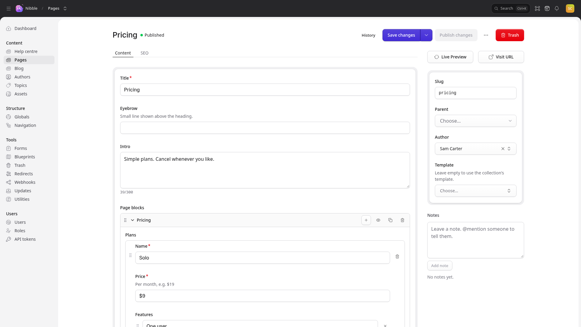
Tidewater’s marketing pages are a stack of blocks that marketing chooses and orders themselves. A replicator declares the sets — the kinds of block — grouped into menus:
- handle: blocks
  field:
    type: replicator
    display: Page blocks
    button_label: Add block
    sets:
      content:
        display: Content
        sets:
          rich_text:
            display: Text
            icon: text
            fields:
              - handle: text
                field: { type: rich_text, required: true }
          pricing:
            display: Pricing
            icon: layout-grid
            fields:
              - handle: plans
                field:
                  type: grid
                  add_row: Add plan
                  fields:
                    - handle: name
                      field: { type: text, required: true }
                    - handle: price
                      field: { type: text, required: true }
                    - handle: features
                      field: { type: list }
Each set is drawn by views/sets/<set handle>.vue in the theme, which receives the set’s fields as props. The
Getting Started guide builds the pricing block end
to end, and Theme components covers the Blocks component that renders them.
Tip
Nibble ships a standard set of blocks — text, quote, call to action, image, gallery and embed — as
nibble::page_fields.blocks. Reference it with field: nibble::page_fields.blocks when you need nothing more.
When you do, copy it into your blueprint and add to it.
Caution
Removing a set that pages already use strands the blocks written with it. nibble:check refuses the change and
names the pages; move their content first, or keep the set.
5. Fieldsets: fields written once
A fieldset is a list of fields several blueprints import. Nibble ships four:
| Fieldset | Fields |
|---|---|
nibble::seo |
the SEO title, description, share image, canonical URL and noindex |
nibble::page_fields |
a title and the standard blocks |
nibble::post_fields |
a title, an excerpt and a body |
nibble::featured_image |
one image |
Import a whole fieldset, or one field of it:
- import: nibble::seo
- handle: blocks
  field: nibble::page_fields.blocks
Tidewater’s call-to-action fields appear on pages, posts and customer stories, so they are a fieldset of its own:
bin/rails nibble:generate:fieldset cta
# site/schema/fieldsets/cta.yml
title: Call to action
fields:
  - handle: cta_heading
    field: { type: text }
  - handle: cta_link
    field: { type: link }
and each blueprint says - import: cta. Change the fieldset and every blueprint using it changes with it.
6. Conditional fields
A field can appear only when another has a certain value. Tidewater’s page hero is either an image or a video:
- handle: hero_kind
  field:
    type: radio
    options: { image: Image, video: Video }
    default: image
- handle: hero_image
  field: { type: assets, max_files: 1, if: { hero_kind: image } }
- handle: hero_video_url
  field: { type: text, input_type: url, if: { hero_kind: video } }
The form shows and hides them as the editor works, and validation follows: a hidden field is never required. The
keys are if, unless, show_when and hide_when, and each has an _any form — if_any — that passes when any
one condition matches rather than all of them.
7. Generated types
Every blueprint becomes a TypeScript type in site/types.d.ts, named after the collection and
blueprint: PostsPost, PagesPage, HelpArticle. Your views import them:
import type { ViewProps, PostsPost } from '@site/types'
so page.excerpt is known to exist and a typo fails vue-tsc rather than a visitor’s page.
Important
The types are regenerated by the generators and by bin/rails nibble:schema:types. Edit a blueprint by hand
and nibble:check reports the types as out of date until you run it — which is what stops a view using a field
that no longer exists from reaching production.
8. What’s next
- Taxonomies — the authors and topics a post relates to.
- Changing the schema — renaming or removing a field once content uses it.